The Story of the Highboard

>> 6.24.2015

Remember a while back I posted about this space and my search to find the perfect piece of furniture?

Well after months of stalking Craigslist and finding nothing in my price range that I liked, I was getting pretty discouraged. I saw a really awesome piece being sold by VintageMod365 but it looked too tall for my space, so I went to see it in person and kind of fell in love. Except the annoying play-it-safe side of me (that I try to keep gagged in the basement) kept whispering, "It's toooo mid-century maaannndiieeeee. People will think you are weeeeiiiirrrrrd." So I thought about it a few days, consulted my friends (who said I would be crazy to NOT get it,) and went with my gut and took the plunge.

It's a danish style teak highboard from the 1960's and it's in really great shape. And at just under four feet tall and four feet wide, it's the perfect size for the wall. But more than anything I love it because it's very ME. Even if that means I am weird.


At this angle you can see how the piece sits in reference to the family room.


Isn't she beautiful?


 If you live in the DFW metroplex and you're looking for a mid century modern piece, check out VintageMod365 on Facebook or visit their booths at the Allen and Inwood Antique Malls. They have a great inventory with new stuff all the time, their prices are fair (which is hard to find around here when buying mid century) and the owners Wade and Matt were very nice and accommodating.

Read more...

Evolution of Style

>> 6.22.2015

Remember when I shared with you my childhood bedroom styles and what our living room looked like in our first home? I thought I'd share a little bit about my design style in the time period between high school and marriage, because I can tell you're just dying to know.


Aside from a few semesters with roommates, I lived with my parents throughout my college years. I was also fortunate enough to work at Havertys Furniture for the majority of that time as well, and I learned a lot about furniture and the furniture business. Being a poor college student, I definitely couldn't afford most of the things there, but with the help of a healthy employee discount, I saved up to buy this bedroom set from Vaughan. 

Well, it was the 1999 version of this set, since they don't make the exact one anymore. But it was worse, if you can imagine that. Would I have picked out something different if I could have afforded it? Possibly. Would it have looked any better? Probably not. 
It's just sooo matchy-matchy, but I loved it then and that's all that matters, right? Also imagine sage green walls about this color... and solid sage green bedding. I really liked the color apparently. 


But the thing I was most proud of in my room were my black and white photo prints. I loved the thoughtful and whimsical photography of Robert Doisneau and other mid-century photographers, and I chose these four large-scale prints to put in my room. And honestly, the black and white photos up against the green actually didn't look too bad.

Don't you love the freedom in this piece? My favorite is the kid on the right with the tie and suspenders. He doesn't care that he looks like a dork. Nope, he's having FUN. 
Champs de Mars Gardens
My degree is in music, so this one was a particular favorite. Don't worry about the hair. Save the cello!
Musician in the Rain
And who doesn't think elephants shoved into telephone booths are adorable?
Trunk Call
I love this photo because it's pretty obvious that he's not gonna make it, but man, he's going for it with arms outstretched. In a time of my life when there was a lot of unknown ahead of me, this photo really spoke to me.
Jumping the Puddle
Unknown
So there's a little bit about my design style in my 20's and what exciting things were in my room. What about you? How would you describe your design style in your college years? I'd love to hear!


Read more...

Poor Man's West Elm

>> 6.02.2015

I've been busy over here... but not with many home projects. I live in Dallas, and have you SEEN the amount of rain we've gotten in the last few weeks? It's crazy. We've stayed dry and really enjoyed the rain, but now the sun is here, school is almost out, and it's time to start the projects up again.

So the West Elm catalog came today, and as I was thumbing through I noticed a room that looked a little familiar.


Light gray walls, nice blue accent wall, linen upholstered bed, navy and gray patterned bedding, mid century side tables, glass lamps....

It kind of reminds me of our master bedroom.


So it's not EXACTLY the same, but a lot of the same elements are there. I would never ever dare say I can put together a room like West Elm can, but it did make me feel good about the choices I made in the room. Sometimes, well letsbehonest, ALL the time, I second and third guess my design choices. And it's even more frustrating when you have a thrift store budget instead of a West Elm budget, you know what I mean? So the fact that I could pull something together even remotely similar to West Elm before the catalog even came out, gave me a little design self-esteem boost.

Just call me the Poor Man's West Elm.

Read more...

WILLN (What It Looks Like Now)

>> 4.22.2015

There's lots of spots in my house that I wish I could change. I think every person probably feels that way, right? This spot in front of our kitchen and next to the stairs is one of those places. We've had this bookcase here since we moved in, and although it fits the space just fine, I think it's too dark and a little boring. Because it's so dark, its been a little difficult to decorate, and so I feel like it's always in a state of flux. And when the new bookcases in the music room got put in, this little bookcase seemed to collect all the reject accessories. Poor guy. This is how the space looks right now.

It was looking so dreary over there I compensated by adding the bright flower canvas. It's a little much I think. But hey, it's spring!

You may remember it looking like this from a previous post:

Anyway, for a while now I've been searching for a buffet/sideboard/credenza/dresser-type piece to put in its place. I don't have a huge budget though, so the search has been a little frustrating. If I had an unlimited budget however, I would love to have one of these.
Love the thin gold legs on this, don't you??? I don't have a source or a price.

 Oh Dallas, why do you have to care about Mid Century Furniture and overprice everything??? This one is $775.

West Elm $900

 This is for sale in Dallas for a bazillion dollars $725.

I love this vintage credenza in Emily Henderson's house. Staged for Christmas, but you get the idea...

West Elm $700

Do you have a favorite? Obviously all of these are out of price range, so I'll keep looking for that perfect piece at the right price.


Read more...

New Addition

>> 4.13.2015

I was strolling around Salvation Army as I do every week more often than I'd like to admit,  and almost missed this beauty hiding amongst the big bulky furniture.


I'm not sure if the navy blue wool fabric is original, but it's in perfect condition, a total steal for $50, and goes great in our family room!


Read more...

Side Table Makeover

>> 4.03.2015

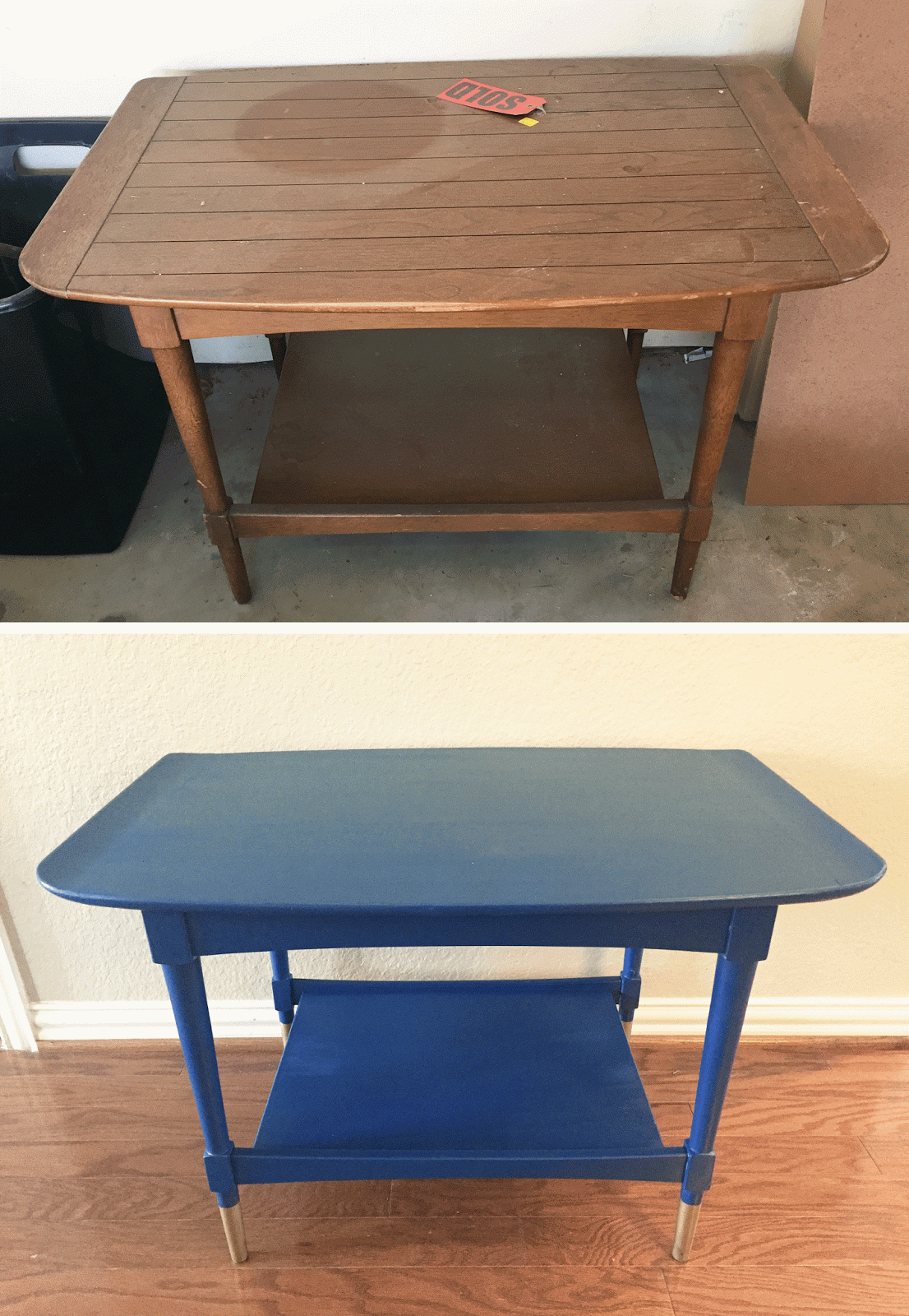
I got this lovely, but confused side table at Salvation Army for $13. The legs are mid century modern, the curved sides of the top have an Asian feel, and the planked wood is a little bit country. I had plans to refinish it, but it sat in our garage taking up walkway space for a few months before I had the gumption to work on it.


I hesitated working on it because of step one: filling in the lines. The planked wood look just didn't fit, so I grabbed some wood filler and started filling the holes in. Pretty sure I put too much on, but I wanted to make sure it got in the grooves and had room to sand down to level.


When I got to sanding it however, it was a beast. I used 60 grit sand paper, which did the job, it just took a really long time. I finished up with a fine grit sand paper to smooth it down.


Instead of my regular method of priming, painting and sealing, I tried something a different and used chalk paint. I got some Chalk Country Paint from a local antique mall and chose Sailor Blue.

And because there are a gazillion examples out there of painting with chalk paint, I'll spare you the details. I must say though that it is a totally different experience painting with chalk paint. The texture of this paint was like thick chocolate pudding, so it's virtually drip-proof, which is super nice. Chalk paint dries fast, so I was able to do three coats of paint in a matter of hours. As thick as this paint is, it doesn't cover well. I didn't want a distressed look on this piece so I was very liberal with the paint. However, with chalk paint you get a very flat finish, and it gets dirty or chalky really quickly. So its important to seal it. 

You can choose to seal with wax or with polycrylic. I chose poly because I don't have to re-seal it like you do with wax. 

But first I taped up the legs and sprayed the bottoms gold to give them a "dipped" look. This might possibly be the worst DIY process picture I've ever taken. You're welcome. 


I let the spray paint dry, did a coat of polycrylic, let it cure, and then brought it in to stage.

I plan on selling this, so the staging is just for fun. Because the side table is such a statement piece, I decided to go with a monochromatic look and bring in other bright blues. It's like Cinderella's dress color and I kind of dig it. The blue pillow is from Ikea, the flowered pillow is new at Target.


And here's a before and after:


Read more...

Mini Makeover Monday - Gold Shell Tray

>> 3.30.2015


I feel like all I've had time to do lately are mini makeovers, but I do have a few bigger things coming. But for today, I'm posting another makeover, and it's one you can do!

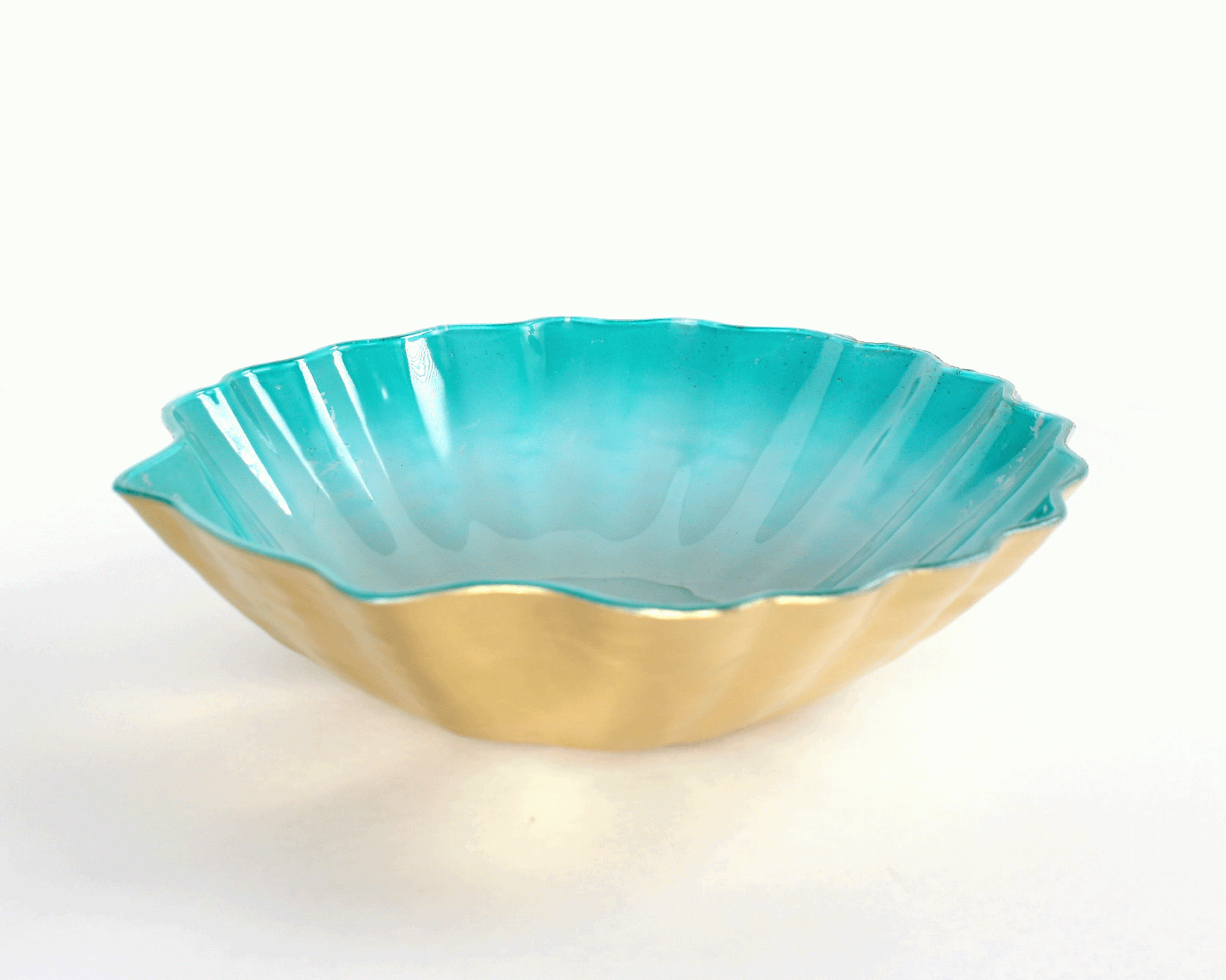
I recently discovered the 99¢ Only Store, which is funny because not everything in the store is ONLY 99¢, but I digress. It was your average dollar store-type with average dollar store junk, but I did find a few things like this elephant coin bank, a cute mug, and this plastic shell tray, each 99¢.


Okay, so the shell tray is a little boring, but I knew it could be awesome, so I bought a few and got out my trusty spray paint. Lucky for me, and to my husband's dismay, I keep all the left over spray paint for projects like this, so I have lots of colors on hand.

First I taped off the corners. I was going to lay it upside down to spray paint so I didn't need to cover the inside.


I then sprayed a color on the backside of the shell. There was already a teal faded color treatment on the shell, so I chose colors that would go with that.  Because I sprayed the backside, it made the inside of the shell super glossy because the color is showing through the plastic.


Then I sprayed two coats of gold spray paint over that and let it dry completely.


And that was that! I chose not to do a top coat because in my experience it takes the shine off the gold paint, and I didn't want to do that. But if you want a little more durability, you can do it and it will still look nice.


 Here they are! Not bad for a dollar, right? Which one is your favorite?


So now I have five of these... who wants one???

Read more...

About This Blog

  © Blogger template Simple n' Sweet by Ourblogtemplates.com 2009

Back to TOP